Five Simple Ways to Make Sure Your WordPress Website is Accessible


Do you want to build a website that’s designed for everyone, regardless of the users’ abilities?
Then WordPress is for you!
Users and businesses prefer this platform due to its simplicity and ability to adapt. However, it’s important to keep in mind that accessibility must be a top priority in web design.
One way to let everyone easily interact with your business is through implementing a WordPress accessibility plugin into your website.
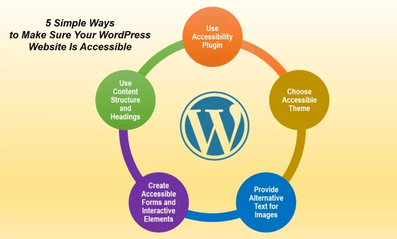
Below, we will see 5 easy steps you can take to make your WordPress site accessible for everyone.
Why Accessibility Matters with WordPress?
Before going into the practice steps, we need to know the importance of WordPress website accessibility.
Web accessibility allows users with different types of disabilities, including visual, auditory, physical, and cognitive, to browse your site. Here are a few reasons why making your WordPress website accessible should be a priority:
Many countries, including the United States, have laws that require websites to be accessible to people with disabilities. By ensuring your WordPress website complies with these regulations, you can avoid potential legal issues.
Better navigation, clear content structure, and a responsive design enhance the overall user experience. By making your website accessible, it doesn’t only accommodate users with disabilities but also reaches a more diverse and inclusive community, broadening your audience.
In addition, accessibility practices are also good for SEO. It’s important to build compliant websites because search engines, like Google, will rank a site they deem “more accessible” above one that is not.
Thus, making your websites accessible can boost your SEO efforts and increase traffic.
How to Make Your WordPress Website More Inclusive?


Now that we’ve discussed why website accessibility should be your priority, it’s time to explore five simple ways to make sure your WordPress site is open to all, regardless of their disability status:
1. Use a WordPress Accessibility Plugin
For the best user experience on your WordPress site, accessibility is key. Luckily, there are plugins made for just this purpose of detecting and patching typical accessibility problems.
These tools automate the accessibility fixes to skip navigation links, add alternative tags for images, and keep a proper heading hierarchy.
They also provide the option for users to modify text contrast, font size, and font face as per their preferences.
With an accessibility plugin, you can enhance the accessibility of your WordPress website and make it barrier-free for everyone.
2. Choose an Accessible WordPress Theme
Choose themes with accessibility features built such as semantic HTML markup, readable fonts, and configurable color schemes. These themes are often clean and minimalist, so readers have fewer elements to distinguish from the text.
An accessibility-focused theme can save you time and energy by making your site inclusive to everyone.
3. Provide Alternative Text for Images
Images should be accessible to everyone when creating web content. Visually impaired people and those who use screen readers may struggle to view images on the website without descriptive alternate text (alt text).
Alt text describes the image for those who cannot see making it accessible to all users. By taking this small but important step, you can ensure that your content is accessible to everyone and enjoyed by all.
4. Create Accessible Forms and Interactive Elements
Interactive elements such as buttons, forms, and navigation menus are important, but you need to ensure they’re accessible to everyone.
To do this, use clear labels for form fields and make sure all interactive elements can be navigated using a keyboard. It’s helpful to test these features with keyboard navigation to identify potential issues that need fixing.
By creating accessible forms and website elements, we can create a more inclusive digital experience for all users.
5. Use Proper Content Structure and Headings
Proper website structure properly makes your content easy to use and understand. Use headings in a hierarchical manner. The main topic or title should be marked as <h1>, while subsections should be <h2>, and so on.
Avoid skipping heading levels as it can confuse individuals who use screen readers and disrupt the flow of content. By planning the hierarchy of your content well, you can make it more accessible and improve its overall quality.
WordPress Accessibility for More Inclusive Online Spaces
By proactively implementing the above measures to make your WordPress site accessible, you create a more inclusive online space.
Accessibility is not about just meeting guidelines, it’s about making the web more welcoming and inclusive to all types of users. It’s never too early to start opening your website to a larger audience through accessibility.
Read more: 11 Blogging Tools for Beginners


